Create a Color Coding Calendar to Boost Your Organization
Discover how to build a color coding calendar that simplifies your schedule and enhances productivity. Learn practical tips today!

When you look at a calendar packed with appointments, what do you see? If it's just a wall of black text, you're making your brain work way too hard. Color coding is the simple act of assigning specific colors to different kinds of tasks or events, letting you grasp your schedule's entire structure in a single glance.
Instead of reading every single entry, you can instantly see where your time is going. It's a surprisingly powerful way to visually organize your time and cut through the mental clutter.
Why a Color Coding Calendar Transforms Your Schedule
A monochrome calendar feels overwhelming because every entry screams for your attention equally. It's impossible to quickly tell what's a critical deadline versus a casual coffee meeting. This is exactly where color coding changes the game. It's not just about making things look pretty; it’s a strategic hack that uses visual cues your brain can process in a fraction of a second.
A big part of getting your life in order is placing calendars front and center of your daily routine. By adding that layer of color, you’re turning a passive list of to-dos into an active, intelligent dashboard for your life.
See Your Day in an Instant
With a solid color system, you can immediately tell the difference between the various hats you wear. A freelancer, for example, can instantly see the balance between client meetings (maybe a cool blue) and focused deep work sessions (a productive green). A parent can differentiate work deadlines (a fiery red) from family commitments like school pickups (a warm purple) without reading a single word.
This visual shorthand is just incredibly efficient. It helps you:
- Spot time conflicts before they blow up into real problems.
- Guard your most important time blocks, whether that's for deep work or personal wellness.
- Gauge your work-life balance with a quick, honest visual scan.
The infographic below really brings home how much faster and less stressful this can be.
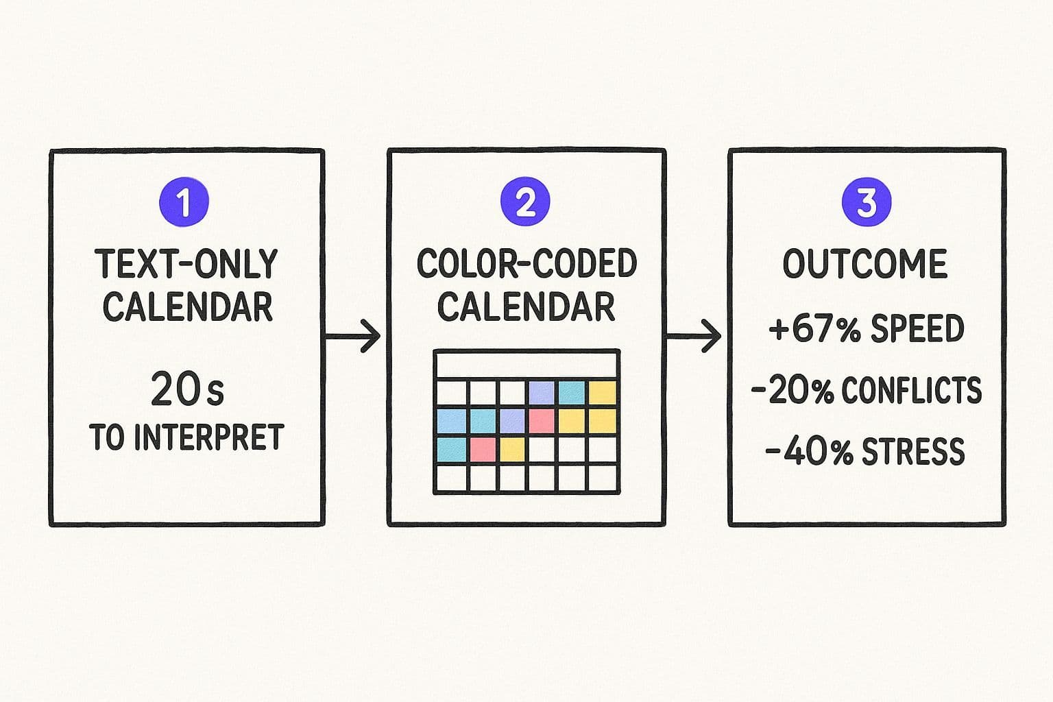
As you can see, the data shows that color coding can make reading your schedule over 67% faster. That speed leads to fewer mistakes and a lot less stress.
A Proven Method for Better Organization
This isn't just a "productivity hack" I came up with; the benefits are backed by real data. A 2022 case study discovered that teams using color-coded calendars experienced a 23% drop in scheduling conflicts and a 17% jump in how productive they felt.
Even Google's internal data hints at this—users who bother to color code at least three categories are 34% more likely to check their calendar every day. It helps build that crucial organizational habit.
By assigning specific hues to different roles—like 'Manager,' 'Parent,' or 'Creator'—you're not just organizing tasks. You're giving yourself a clear, visual representation of how you allocate your most finite resource: time.
This system is the bedrock of a truly organized life. If you want to take this even further, combining color coding with a more deliberate planning method is a total game-changer. We dive deeper into this in our guide to building a structured daily planner.
While any calendar app lets you assign colors, platforms like Harmony AI are built to make this effortless. It's designed to be your personal AI assistant for time management. By understanding the context of your events, Harmony AI can learn your color system and automatically categorize and color-code new entries for you. It's the ultimate way to maintain a perfectly organized calendar without the manual effort.
Designing Your Personal Color Coding Framework
The best color-coding system is the one you don’t have to think about—it just clicks. There's no single "right" way to do it. The entire goal is to create a visual language your brain understands at a glance, turning chaos into clarity.
It all starts by identifying the major pillars of your life. What are the big roles you play every day?
Think about the distinct areas that demand your time and energy. These will be your foundational categories. For a busy professional, this might look like 'Deep Work,' 'Client Calls,' 'Admin Tasks,' and 'Team Meetings.' For a parent juggling a career, the list might be 'Work Projects,' 'Family Time,' 'Personal Errands,' and 'Health & Fitness.'
Once you have these core buckets, you can start giving each one a unique color. This simple, intentional act is what transforms a jumbled list of tasks into a scannable, meaningful overview of your life.
Choosing Your Color Palette
Believe it or not, the colors you choose can subtly influence how you feel about your schedule. You can go for a high-contrast, energetic palette if you’re in a fast-paced role, or something more muted and calming if your work is creative or requires deep focus. Color psychology is a real thing, and you can use it to reinforce your intentions.
- For a high-energy vibe (high contrast):Red: This is perfect for the non-negotiable stuff. Think urgent deadlines or critical appointments. It naturally screams "pay attention!"Bright Blue: A great choice for client calls or team meetings. It’s associated with communication and trust.Vibrant Green: I like this one for deep work or skill development, since it’s often linked to growth and progress.
- For a calmer focus (muted tones):Forest Green: Excellent for personal time, workouts, or anything that recharges you. It’s grounding and serene.Soft Lavender: A good fit for family commitments or social events. It feels warm, gentle, and personal.Slate Gray: I use this for the boring-but-necessary admin tasks. It’s neutral and doesn't fight for attention.
The real magic happens when your color-coded calendar meets a structured planning method. When you block out time for specific roles and color those blocks accordingly, you get an honest, visual report card of where your time is actually going.
This is a cornerstone of effective time management. In fact, combining this visual system with a dedicated planning approach is one of the most powerful things you can do to take back control of your schedule. We actually dive deep into this synergy in our guide to the time blocking calendar method.
A Starter Framework For Your Calendar
To help you get the ball rolling, I've put together a sample table connecting common life domains with colors and their psychological associations. Think of this as a launchpad, not a rulebook.
Sample Calendar Color Coding Schemes
Use these examples as a starting point to build your own personalized color coding system based on your life's key domains.
| Category | Suggested Color | Psychological Association & Use Case |
| Deep Work | Deep Blue | Associated with focus, intellect, and productivity. Ideal for blocking out non-negotiable time for your most important tasks. |
| Meetings | Orange | A social and energetic color. Helps distinguish collaborative sessions and external calls from solo work. |
| Health & Wellness | Green | Universally linked to nature, health, and renewal. Perfect for workouts, meditation, or doctor's appointments. |
| Personal & Family | Purple | Often represents wisdom and devotion. A warm color for date nights, school events, or time with loved ones. |
| Admin & Errands | Gray | A neutral, practical color for life's logistics, like paying bills, grocery shopping, or responding to routine emails. |
Take some time to really nail this framework down—it's the most important step.
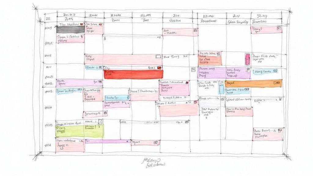
Alright, you've hammered out your color framework. Now for the fun part: making it real in your digital calendar. This is the moment your abstract color system becomes a concrete, day-to-day tool that actually works for you.
Most of the big players, like Google Calendar and Outlook, make this pretty easy to set up.
The basic idea is to create separate "sub-calendars" for each of your main life buckets—think 'Work Projects,' 'Family,' and 'Personal Health'—and then assign your chosen color to each one. When you add a new event, you just tell it which sub-calendar it belongs to, and voilà, it gets the right color. This is a great starting point for seeing your system come to life.
The Manual Route in Popular Calendars
In most standard calendar apps, you’re the one in the driver's seat. It's a hands-on process, which means you have to consciously categorize every single appointment to keep the system clean.
- For Google Calendar users: You can create as many calendars as you need under "My calendars," giving each its own color. When you make an event, you just pick the right calendar from a dropdown. Simple.
- In Outlook: The process is similar. You can create new calendar groups and use the "Categorize" function to slap the correct color tag on any new appointment.
This manual approach absolutely works. Its biggest flaw? It hinges entirely on your own discipline. We’ve all had those chaotic days where the last thing on your mind is categorizing a calendar event. One missed tag here, another there, and your once-pristine system starts to unravel.
And if you're juggling complex schedules, like co-parenting, you might even find that specialized co-parenting calendar apps offer features better suited for that kind of visual organization.
Let Harmony AI Handle the Work
This is where things get interesting. Instead of you doing all the manual labor, an intelligent tool can maintain the system for you. This is exactly what makes using something like Harmony AI to power your color-coded calendar a total game-changer.
Think about it: an email from a new client hits your inbox. The old way involves you opening your calendar, creating an event, typing in the details, and then manually selecting your "Client Work" color. With Harmony AI, it just happens. The AI understands the context and automatically creates a perfectly color-coded event on your calendar. No clicks, no hassle.
The real leap forward is moving from manual tagging to intelligent automation. It turns your calendar from a static grid you have to constantly manage into a dynamic assistant that organizes itself.
The magic of an AI-driven calendar is its ability to learn your workflow and keep everything consistent with almost zero effort from you. You can learn more about how this works in our guide to the best AI calendar tools out there.
With Harmony AI, you define your color framework just once. From then on, the app does the heavy lifting, making sure the rules are followed and your schedule remains a constant source of clarity, not chaos.
Taking It to the Next Level with Advanced Strategies
Once you’ve got the basics down and color-coding your calendar feels like second nature, it's time to layer in some more advanced tactics. This is for all the project managers, team leads, or anyone out there who feels like they're juggling a dozen high-stakes commitments at once.
We’re about to turn your calendar from a simple schedule into a dynamic command center.
One of my favorite techniques is playing with color saturation to show priority. It’s powerful but surprisingly simple. Instead of grabbing a totally new color for every little thing, you just use different shades of the same base color.
Let's say your "Client Project" category is red.
- A dark, bold red instantly signals a hard, unmovable deadline. No excuses.
- A standard red could be for a regular client check-in meeting. Important, but routine.
- A light pink might be perfect for a low-priority follow-up task. Something to get to, but not urgent.
This approach gives you a whole new dimension of information at a glance, without turning your calendar into a confusing mess of colors.
Using Focus Colors and Team Assignments
Here’s another method that works wonders: assign a unique "focus color" for each day. This color highlights the one thing that, if you get it done, makes the day a win. If your deep work color is blue, you could make the day’s most critical task a vibrant, electric blue that just pops off the screen.
This forces you to be incredibly intentional about your priorities. Your eye is immediately drawn to what truly matters, so you don't get sidetracked by the sea of less important (but still colorful) tasks.
For teams, assigning a specific color to each person on a shared calendar is a game-changer. You can see instantly who's responsible for what—a task, a meeting, a project phase. This is an absolute lifesaver in remote setups where those visual cues are everything for keeping collaboration smooth.
The Power of Automation in Complex Systems
As your color-coding system gets more sophisticated, managing it by hand can start to feel like a job in itself. The more complex the schedule, the more you need automation.
This is exactly where an intelligent tool like Harmony AI comes in. It learns your advanced rules—like automatically assigning a darker shade to events with words like "deadline" or "final"—and just does it for you.
Harmony AI makes sure your system stays consistent and accurate, which frees up your mental energy from the constant busywork of managing the calendar itself.
These kinds of systems are catching on, especially as our work lives get more flexible. A 2023 survey found that 62% of regular digital calendar users use color-coding. And 41% are already managing five or more distinct color categories—a number that skyrockets for people juggling complex schedules.
This trend really just highlights how much we need smart, visual organization to cut through the noise. You can read more about the rise of digital calendar trends to see how people are adapting to stay on top of it all.
Common Color Coding Mistakes to Avoid
Even the most brilliant color-coding system can turn into a Jackson Pollock painting of chaos without a few ground rules. I’ve seen it happen time and again. People start with the best intentions, but fall into a few common traps that turn a tool for clarity into a source of total confusion.
If you can sidestep these pitfalls, you'll keep your calendar the reliable, at-a-glance asset it's meant to be.
https://www.youtube.com/embed/mOxeT2_0t2s
The first and most frequent mistake? Using way too many colors. It’s so tempting to give every little task its own unique shade, but this just creates visual noise. It completely defeats the purpose. Your brain simply can't process a dozen different color meanings instantly.
The whole point of a color-coded calendar is to reduce cognitive load, not add to it. If you have to stop and consult a complex key just to figure out what you’re doing today, the system has already failed.
From my experience, sticking to 5-7 core categories is the sweet spot. It gives you enough distinction for the main domains of your life without overwhelming your senses.
Keep It Consistent and Clear
Another major issue I see is a lack of consistency. Using blue for "Work" one week and then for "Personal Errands" the next is a recipe for disaster. This completely erodes the mental shortcuts you're trying to build, forcing your brain to re-learn the system every single time you look at it.
Do yourself a favor: create a simple color key and stick to it. Religiously.
You also need to be smart about your color choices, especially since you're likely viewing your calendar on different screens.
- Avoid similar shades: That forest green and lime green might look distinct on your big desktop monitor, but they’ll probably blur into one on a small phone screen in bright sunlight.
- Opt for high contrast: Make sure your chosen colors actually stand out from each other and against your calendar's background.
The data backs this up. Just look at Google Calendar, which is a giant in this space with over 500 million monthly users. Their user habits tell a story. The average user has just 4.2 color categories. Blue for work (42%) and green for personal (31%) are the most common choices by a long shot, which really highlights our natural preference for a simple, effective system. You can dig into more of these calendar market trends on marketreportsworld.com.
This is where a tool like Harmony AI can really help. It learns your categories and applies your color rules to new events automatically. By taking the manual work—and the chance for human error—out of the equation, it keeps your system pristine and effective day in and day out.
Questions That Pop Up
Even with the best-laid plans, a few questions always come up when you first dive into color-coding your life. I've heard a bunch of them over the years, so I've gathered the most common ones here to give you the clarity you need to build a system that genuinely works for you.
So, How Many Colors Should I Actually Use?
I've found the sweet spot is somewhere between 5 to 7 core colors. That's usually enough to cover the big pillars of your life—work, family, personal time, health—without turning your calendar into a Jackson Pollock painting.
If you go much higher than that, you start to lose the at-a-glance clarity that makes this so effective in the first place.
My advice? If you're just starting out, keep it simple. Pick three or four of your most critical categories and build from there. You can always add a new color later if a new priority consistently shows up on your schedule.
What's the Best Way to Pick My Colors?
Honestly, the best system is whatever feels most natural to you. But if you're looking for a good starting point, leaning on some common psychological color associations is a great hack. We're all wired to recognize them.
- Red for urgency: This one's a classic. Think hard deadlines, can't-miss appointments, or anything that screams "pay attention to me!"
- Green for wellness: It just feels right for workouts, meditation sessions, or doctor's check-ups.
- Blue for deep work: There's a reason so many productivity apps use blue. It's often associated with focus and calm, perfect for blocking out time to get in the zone.
The real golden rule here is consistency. Once you decide green means "health," stick with it. It's helpful to jot down a simple color key and keep it on your desk or a sticky note on your monitor while you're still building the habit.
Can This Actually Work for a Shared Team Calendar?
Absolutely. In fact, it’s a game-changer for team collaboration. Color-coding brings a level of transparency to a shared calendar that you just can't get otherwise. It provides instant visual cues about who's doing what and where resources are going.
Assigning a unique color to each team member is a popular approach. You can see at a glance who's leading which meeting or handling a specific task without ever having to click into the event details. This small tweak makes a massive difference on shared projects.
Another way to go is to color-code by project, task type (like 'Client Meeting' vs. 'Internal Review'), or even status ('In Progress' vs. 'Completed'). The key is just making sure everyone on the team agrees on a simple, shared color key to keep things from getting chaotic. That way, the calendar remains a powerful asset for the whole team.
Ready to let automation handle the tedious work of organizing? With Harmony AI, you can set up your color framework once and just watch as new events are intelligently categorized and colored for you. It’s the smartest way to keep your calendar perfectly organized, turning your schedule from a source of chaos into a source of clarity. Start aligning your time with your purpose today.

Harmony - AI Planner
Plan your weeks, plan your life. Define your mission, plan weeks around your roles, and stay on track every day with AI guidance.
Download FreePersonal Mission
Define your deeper why
Weekly Planning
Role-based goal setting
AI Guidance
Smart suggestions & nudges
Celebrations
Stay motivated daily


